Author’s Note: This article builds upon groundbreaking research originally reported by MIT News. I am deeply grateful to the MIT research team and the MIT News Office for making their MIT Periodic Table findings accessible to the public. This exploration reflects my own interpretations and expansions inspired by their pioneering work.
The MIT periodic table of machine learning offers a revolutionary way to connect AI algorithms, revealing hidden structures that extend far beyond traditional two-dimensional analysis. In the world of artificial intelligence (AI), researchers often operate in the unknown, creating new algorithms to solve complex problems. However, understanding how these algorithms connect and build upon one another can feel like a daunting task. Fortunately, MIT Periodic Table researchers have created a groundbreaking presentation of machine learning that offers a unifying framework for AI algorithms. But what’s truly exciting isn’t just the table’s 2D structure — it’s how it opens the door to high-dimensional discoveries that could reshape the future of AI.
Table of Contents
I. What the Grid Reveals: Understanding the MIT Periodic Table Of Machine Learning Framework
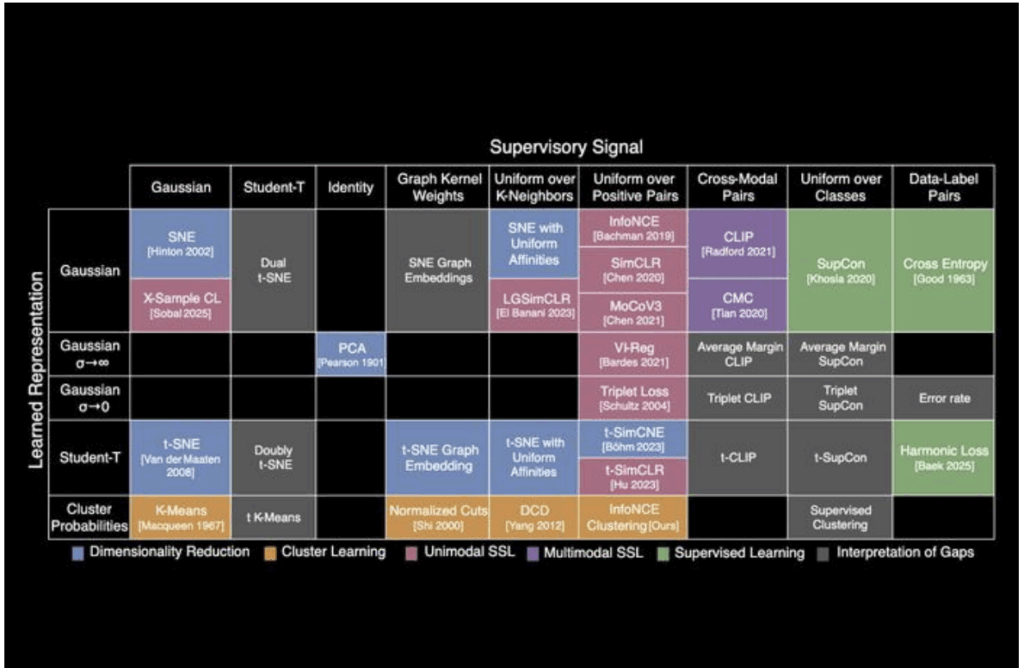
The periodic table of machine learning organizes over 20 classical algorithms into a matrix based on two axes:
- Learned Representation (e.g., Gaussian, Student-T, or Cluster Probabilities)
- Supervisory Signal (e.g., Contrastive Learning, Cross-Modal, or Uniform over Classes)
At first glance, the MIT Periodic Table 2D layout seems simple. But by understanding the relationships between the rows (representations) and columns (supervision methods), it’s clear that each algorithm shares underlying mathematical principles. Despite operating differently, these algorithms ultimately learn similar relationships between data points — and that’s where the magic happens.
II. Why Dimensionality Matters: Beyond 2D
While the MIT Periodic Table serves as an excellent roadmap for existing AI methods, most of these algorithms operate in high-dimensional spaces (N-dimensional manifolds) — and that’s where their true power lies.
To better understand this, let’s break down what happens when we move from the MIT Periodic Table 2D table to N-dimensional spaces:
1. PCA vs. t-SNE: A 2D vs. N-Dimensional Contrast
Principal Component Analysis (PCA) and t-distributed Stochastic Neighboring Embedding (t-SNE) are classic dimensionality reduction techniques. In the 2D framework, PCA is often used for linear transformations, while t-SNE helps map data points into lower dimensions for visualization.
- In the MIT Periodic Table 2D illustration, we understand the basic concept of dimensionality reduction.
- In higher dimensions, these algorithms scale. t-SNE, for example, can adapt itself to visualize non-linear relationships across vast datasets with more than just two variables, leading to deep insights in image recognition, anomaly detection, and beyond.
Here, the geometry of loss functions changes dramatically when you move to N-dimensional spaces. Algorithms like t-SimCLR extend contrastive learning to higher-dimensional embeddings, significantly improving clustering and classification in datasets with complex structures.
2. t-SimCLR: Scaling Contrastive Learning to Higher Dimensions
Here, the geometry of loss functions changes dramatically when you move to N-dimensional spaces. Algorithms like t-SimCLR extend contrastive learning to higher-dimensional embeddings, significantly improving clustering and classification in datasets with complex structures.
III. Moving Beyond the Grid: Exploring Uncharted High-Dimensional Paths
Now that we’ve established the basic MIT Periodic Table grid, let’s explore what happens when we push the boundaries — particularly when we look at empty cells in the table. These gaps aren’t just unexplored areas; they represent opportunities for discovery.
- InfoNCE + Clustering
InfoNCE is a popular contrastive learning algorithm used to maximize mutual information between data points. However, the empty cell where InfoNCE intersects with clustering suggests untapped potential for combining these techniques.- Potential Discovery: Imagine self-supervised clustering algorithms powered by contrastive loss — algorithms that don’t just identify clusters but actively learn to optimize clustering through contrastive relationships. This approach could be a game-changer for unsupervised learning and anomaly detection, especially when labeled data is scarce.
- Cross-Modal Pairings + Cluster Probabilities
Many current algorithms are single-modal (e.g., working with images or only text). However, the empty cell between cluster probabilities and cross-modal pairings hints at a breakthrough in multi-modal learning.- Potential Discovery: Imagine an algorithm that could cluster data from multiple modalities (text, images, audio) based on their inherent relationships, without needing manual labeling or supervision. This could significantly improve how we process and integrate different data types.
IV. What’s Next: High-Dimensional AI Discoveries Await
The unification of these algorithms through the MIT periodic table doesn’t just categorize existing knowledge. It suggests that cross-disciplinary, cross-modal, and high-dimensional algorithm designs are the future. Here are a few areas where we might see major breakthroughs:
- Manifold Learning and Contrastive Loss
Algorithms like SimCLR and MoCo currently use contrastive loss in low-dimensional spaces. But what happens when we apply these techniques in higher-dimensional spaces?- Breakthrough Opportunity: Unlocking deeper feature spaces and more robust models for language, images, and audio could lead to more accurate predictions and better understanding in real-world applications.
- Supervised Clustering
The combination of supervised learning and clustering might give rise to new hybrid models that can process unsupervised data while maintaining high accuracy in predictions.- Breakthrough Opportunity: Hybrid models might enable us to handle more diverse datasets, providing better accuracy without requiring labeled data.
- Probabilistic Alignment of Multi-Modal Data
Cross-modal alignment, powered by Probabilistic Clustering, could allow for the creation of joint embeddings across modalities.- Breakthrough Opportunity: This is crucial for models that need to integrate text, images, and video while preserving context.
V. Conclusion: The MIT Periodic Table as a Blueprint for Future AI
The MIT Periodic Table presents a powerful framework for understanding AI models in ways that go beyond mere classification. By mapping the relationships between algorithms and highlighting where techniques can be combined or extended, this framework opens the door to countless opportunities in AI development.
As researchers and engineers continue to experiment with high-dimensional projections, new algorithms will emerge, making machine learning models more efficient, robust, and adaptive than ever before. The question now is: What gaps will you fill next?
For Readers Interested in the Technical Details
For those who wish to explore the mathematical structure behind the MIT Periodic Table of machine learning — and see a working Python example — the following annex provides a deeper dive into the methods and representations discussed above.
VI. Annex: Mathematical Foundations and Python Demonstration
While the main article provided a conceptual overview of the MIT Periodic Table of machine learning, this appendix explores the mathematical structure underlying some of the algorithms discussed. By focusing on the shared optimization principles and loss functions, we can better understand the relationships between different learning methods.
Below are key mathematical equations illustrating these similarities:
1. Decision Trees and Random Forests
Decision Trees: The decision tree algorithm splits data based on a chosen feature, aiming to maximize the purity of the resulting splits.
\[ Gini(t) = 1 – \sum_{i=1}^{m} p_i^2 \]
where ( p_i ) is the probability of class ( i ) in the current node ( t ), and ( m ) is the number of classes.
- Random Forests: An ensemble of decision trees, where each tree is trained on a different bootstrap sample of the data. The final prediction is an average of the predictions from all trees. Mathematical Similarity: Both decision trees and random forests rely on splitting data to maximize the purity of subsets, but random forests generalize this idea by using multiple trees to reduce variance and improve predictions.
2. Support Vector Machines (SVM) and Kernel Methods
- SVM: The SVM algorithm aims to maximize the margin between two classes, with the margin defined as the distance between the separating hyperplane and the closest data points (support vectors).
- The optimization objective in SVM is:
\[
\begin{aligned}
\text{Maximize:} \quad & \frac{2}{\| w \|} \\
\text{Subject to:} \quad & y_i (w^T x_i + b) \geq 1, \quad \text{for all } i
\end{aligned}
\]
where \( w \) is the weight vector, \( x_i \) is the input data point, \( y_i \) is the class label (\(+1\) or \(-1\)), and \( b \) is the bias term. This maximization formulation emphasizes geometric intuition, but solving it computationally is easier when reframed as a minimization problem.
In practice, this formulation is often rephrased as a minimization problem for computational efficiency:
\[
\begin{aligned}
\text{Minimize:} \quad & \frac{1}{2} \| w \|^2 \\
\text{Subject to:} \quad & y_i (w^T x_i + b) \geq 1, \quad \text{for all } i
\end{aligned}
\]
where \( w \) is the weight vector, \( x_i \) is the data point, \( y_i \) is the label, and \( b \) is the bias term. While standard SVMs find linear separators, many real-world problems require separating non-linear data — and that’s where kernel methods come into play.
Kernel Methods: The kernel trick allows us to map data into a higher-dimensional space, enabling the algorithm to find a hyperplane that separates non-linear data.
Radial Basis Function (RBF) Kernel:
\[
K(x, x’) = e^{-\gamma \| x – x’ \|^2}
\]
where \( \gamma \) is a parameter controlling the spread of the kernel.
Mathematical Similarity: Both SVM and kernel methods aim to separate data, but kernel methods extend SVM’s idea to non-linear separations by implicitly mapping data into higher dimensions.
3. K-Means and Gaussian Mixture Models (GMM)
K-Means: This algorithm aims to minimize the sum of squared distances between data points and their assigned cluster centroids:
\[
J = \sum_{i=1}^N \sum_{k=1}^K r_{ik} \| x_i – \mu_k \|^2
\]
where \( r_{ik} \) is the responsibility of cluster \( k \) for point \( i \), and \( \mu_k \) is the centroid of cluster \( k \).
GMM: Gaussian Mixture Models use expectation-maximization (EM) to maximize the likelihood of the data given a mixture of Gaussian distributions:
\[
L(\theta) = \sum_{i=1}^N \log\left( \sum_{k=1}^K \pi_k \, \mathcal{N}(x_i \mid \mu_k, \Sigma_k) \right)
\]
where \( \pi_k \) are the mixture weights, and \( \mathcal{N} \) represents the multivariate normal distribution.
Mathematical Similarity: Both K-Means and GMM cluster data, but GMM allows for more flexibility in the shape of clusters by modeling each cluster as a Gaussian distribution with its own covariance matrix.
4. Linear Regression and Logistic Regression
Linear Regression: Linear regression aims to minimize the mean squared error (MSE) between the predicted and actual values:
\[
\text{MSE} = \frac{1}{N} \sum_{i=1}^N (y_i – \hat{y}_i)^2
\]
Logistic Regression: Logistic regression uses the logistic loss function, which is based on the log-likelihood of the data:
\[
\text{Log-Loss} = -\sum_{i=1}^N \left[ y_i \log(\hat{y}_i) + (1 – y_i) \log(1 – \hat{y}_i) \right]
\]
Mathematical Similarity: Both linear and logistic regression aim to fit a model to data, but logistic regression is used for classification tasks, while linear regression is used for predicting continuous values.
Python Code Demonstration of Convergence
Let’s demonstrate the convergence of two related algorithms, K-Means and Gaussian Mixture Models (GMM), with a simple Python snippet.
import numpy as np
import matplotlib.pyplot as plt
from sklearn.mixture import GaussianMixture
from sklearn.cluster import KMeans
from sklearn.datasets import make_blobs

# Generate synthetic data
X, _ = make_blobs(n_samples=300, centers=3, cluster_std=0.60, random_state=0)

# K-Means Clustering
kmeans = KMeans(n_clusters=3)
kmeans.fit(X)
kmeans_labels = kmeans.predict(X)

# GMM Clustering
gmm = GaussianMixture(n_components=3)
gmm.fit(X)
gmm_labels = gmm.predict(X)

# Plotting the results
plt.figure(figsize=(12, 6))

# K-Means
plt.subplot(1, 2, 1)
plt.scatter(X[:, 0], X[:, 1], c=kmeans_labels, cmap='viridis')
plt.title("K-Means Clustering")

# GMM
plt.subplot(1, 2, 2)
plt.scatter(X[:, 0], X[:, 1], c=gmm_labels, cmap='viridis')
plt.title("Gaussian Mixture Model Clustering")

plt.show()
Integrating Mathematical and Python Insights
By combining mathematical analysis with Python code demonstrations, we not only show the similarities between algorithms but also give readers a hands-on understanding of how these algorithms operate and converge. The visualizations in Python make it easy for readers to see the differences in how each algorithm clusters data, deepening their understanding of the theoretical concepts discussed in the MIT Periodic Table.
What the script does step-by-step:
-
Generate synthetic data:
-
Creates 300 random data points grouped around 3 true centers.
-
The points are not exactly spherical (there’s some standard deviation of 0.60).
-
-
Run K-Means clustering:
-
Assigns each point to one of 3 clusters.
-
K-Means assumes clusters are spherical and tries to minimize within-cluster distances.
-
-
Run GMM clustering:
-
Assigns points probabilistically to 3 Gaussian components.
-
GMM allows elliptical clusters (not just spherical), so it adapts better to the shape of the data.
-
-
Create a side-by-side plot:
-
Left subplot: Scatter plot showing K-Means cluster assignments (colored by cluster).
-
Right subplot: Scatter plot showing GMM cluster assignments.
-
-
Display the comparison:
-
Matplotlib window pops up showing the two clustering results side-by-side for visual comparison.
-
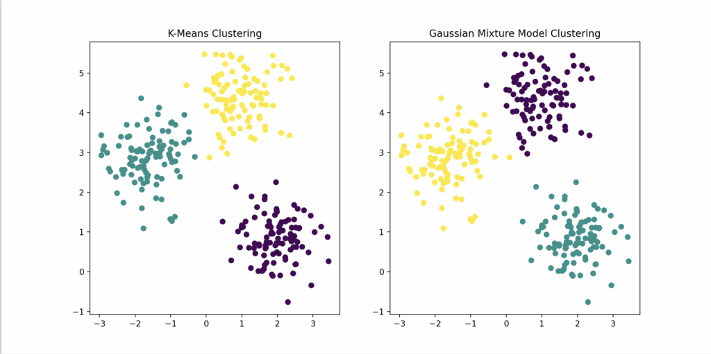
Visually:
| Left Plot | Right Plot |
|---|---|
| K-Means clustered points | GMM clustered points |
| Often looks “rounder,” hard edges | More flexible, elliptical, “soft” cluster shapes |
| Assumes points are grouped evenly | Allows “smeared” or “stretched” clusters |
This visually shows why GMM is more flexible in real-world high-dimensional data compared to simple K-Means.
In simple terms:
| Algorithm | Behavior |
|---|---|
| K-Means | “Which center are you closest to?” (hard assignment) |
| GMM | “Which cluster are you likely to belong to, even partially?” (soft assignment based on probability) |
📘 Need a refresher on the basics?
…If you’re looking for a quick overview of topics related to the MIT Periodic Table, our FAQ page explains AI, NLP, Python automation, and even cybersecurity threats in plain language.
Enjoyed this post? Sign up for our newsletter to get more updates like this!
🔐 Protect Your Privacy
NordVPN is fast, secure, and trusted by millions worldwide.
Get NordVPN →Sponsored Content